trinity catholic school
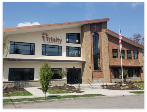
In 2017 Trinity Catholic School built a new school building to replace one that was old, outdated and insufficient for their student needs. The leadership at the school took this opportunity to look at their current logo and website designs and change them from something that was dated and difficult to read and refresh them to be modern, clean, easy to use and evocative of the school's rebirth and dedication to their mission. For this project, we had a mostly blank slate but the main element that was important to keep was a relationship to the number three. This represented the Holy Trinity, which is part of their school name, but also a cornerstone of their Catholic identity. That element is incorporated with the three triangles forming a cross and supporting the T in Trinity. This was the perfect graphic representation of how their religious foundation supports the mission of their school. Below is their prior logo.
Design
The Trinity Catholic School logo is a nod to the history as we carried over the triangle aesthetics from their previous logo, but it also points to the future of the school and its growth with this new modern look. The 3 triangles are a representation of the holy trinity and when combined with the schools name it creates a cross in the negative space.
TYPOGRAPHY & COLOR